http://www.youtube.com/watch?v=rYEDA3JcQqw
Adele - Rolling in the Deep
In this music video I looked at the mise-en-scene and setting.
The video uses a number of conventions from the lyrics to make this and show emotions and feelings.
The lyrics for example "could have had it all" is reflected by the big empty house, broken plates and dust sheets. This emphasises her emotion and despair as she does not have it all, it shows her as lonely, wearing black which has connotations of depression and gives us the impression she has been left by her lover/husband - for example when Queen Victoria's husband died she wore black, so therefore in this video it signifies a loss, along with a depression. The black also contrasts with the broken white crockery which is piled up.
Saturday, 15 October 2011

Sunday, 9 October 2011
My magazine advertisement
After producing my CD covers i designed a magazine advertisement to promote the album.
(click the image to see it in bigger better quality)

(click the image to see it in bigger better quality)

This is my advertisment.
I decided to use the cover of the album as the image on the advert as i thought it would be the best to use as it is eyecatching and so people could recognise it in the shops.
I copied the typography on the back of my album cover to do the artists name and placed it as an angle to look more interesting. I also put some grey outlines around the cover to make it stand out from the background and also look more 3D.
I put a selling point on my advert saying 'Plus Free signed copy for the first 100 buys at www.JackMorgan.co.uk' I think this is good feature to have on an advert as it gives the target audience a reason to buy the album as quick as possible as there are only 100.
I am also advertising the artists website, bringing more potential fans to it and his music by doing so.
I have also put the option to buy the album digitally on iTunes, which is a popular way of downloading music for the contemporary audience of today. It also means that it can easily be put on peoples ipods and phones a lot easier by having this option, therefore keeping the market at a wider selling potential.
I put the release date for the album in the same typography that i used for the track numbers on the back of the album cover, keeping to the trademark unique identity of my artists album. I decided to use buzzwords such as 'Exclusive' and 'Plus' to entice my audience and attract them to the advertisement. I also decided to put a price on the advert to give more information about the album, i researched the price of current artists albums, and decided that this one was an appropriate one. I again advertised that the album had the 'best selling single white wires' on it to add to my selling point for the album and attracting more customers/fans. I decided to keep to the colour scheme i had used for the album as not only does it fit in with the whole theme i used for my artist but it keeps it looking simple as well as interesting, and as i found in my research a lot of top selling artists also do this, and therefore fitting in with my acoustic genre and fitting the wants and needs of my target audience.
CD Cover Design Back
After creating the front cover of my CD album i then designed the back of it.


Final CD back cover.
(click the image to see it in bigger better quality)
(click the image to see it in bigger better quality)

I decided to keep the same colour red that i used on the front, and decided to use it as a house colour for my artist. For the name of my artist i decided to play around with the house colours and fade them together gradually. I used Adobe Photoshop for this so i had a great variety to play around with. I used an image of my artist for the back but this time more of a close up. Again i decided to put an effect on this image to keep in with the theme of the front and make it look more artistic and abstract. I think that the simpleness of the cover looks great and fits in with my acoustic genre as well as being interesting to look at and easy to read. I added the album tracks including the name of the album as one of them and 'White Wires' which i am advertising on my magazine promotion and the front cover of the CD.
I added a barcode also and added my own letters along the top of it including the name of the album and the artists name. Next to the barcode i put the name of a record company which i made up for it, again i used the red house colour to make it stand out and also fit in with the rest of it. I put this in more of an interesting font to make it look more realistic and therefore more appealing to potential buyers. Underneath that i put the website of my artist, credits and copyrights.

I am really pleased with my final result for this, i think it matches my target genre and target audience well and looks like an interesting product.
For example this Adele Cover is similar to my product:

My final Album cover
My final album cover.
(click the image to see it in bigger better quality)

Evaluation
I changed the effect on the background of my picture to make it stand out more and be more eye catching but decided to keep my original idea of having the artist as a normal image. I also changed the name of the album but kept it to do with the idea of walking that i had taken my picture for. I centered the image and blurred the sides so they went into the black background of the rest of it. I think this was is a lot better than my first attempt. I used simple typography, and made the 'Walk to Rome' look like it was actually on the pavement. I I think i used all features well and made the artists name 'Jack Morgan' in red, which fits in with the colour scheme on the back of my album cover and also to give more variety on the cover, whilst still keeping it simplistic. . I also put a selling point on the album cover, advertising the 'best selling single' to attract and persuade people to buy it.
I used Adobe photoshop for both of my designs, giving me a lot of variety and ideas to play around with.
My first attempt for my CD cover
(click the image to see it in bigger better quality)

I decided to make it interesting to look at and keep it simple as the music is acoustic and relaxing, so i thought a more simple cover would be most appropriate.
I placed the image to the right and kept the rest of it black as i thought it looked the best. I decided to blur the background of the image to give a more interesting effect to the album and to make the image of the person stand out. After looking at other acoustic artists CD Album covers i decided to keep the typography simple too. However after reconsidering this i thought it looked a bit boring for what i wanted, i therefore changed my idea slightly.
Saturday, 8 October 2011
Magazine Advert Research
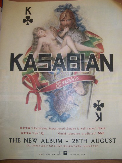
The Kasabian advert was the first one i looked at. It uses a simplistic approach, the typography is quite basic and the advert itself is clear to the point with the main image taking up the majority of the page. The colour's used for the typography link into the main image used, making it simplistic and attractive on the page. I liked this advertisement and it gave me inspirations such as keeping the colour scheme similar to the album cover/main image on mine. The explicit image of the naked woman also reflects the target audience the advert/band are targetting. In the case it would be 16/18+ due to the image of the naked lady.

Kings of Leon was the second advert i looked at, this one also really attracted me. It is simplistic and i liked the way that the main image takes up the whole page, and refers to the title of the album 'Come around sundown'. However i think that this one is a bit too basic for what i want to do, so therefore it gave my ideas to make mine a bit more interesting than this, whilst keeping it simple.
Wednesday, 5 October 2011
CD Cover research

I first looked at Peter Doherty's solo album 'grace/wastelands'. The artwork is really eye catching and is the main feature of the cover. The artists name is in a simple typography above the image. The album is simplistic and attractive. It captures the genre of Peter Doherty's acoustic/indie genre.

The next one i looked at was a single from Babyshambles - 'Down in Albion'. Again this cover is very simplistic, appearing in a hand written typography, making it appear rustic and matching the genre once again of simple/acoustic/indie.

The Arctic Monkey's album 'Leave Before the Lights Come On' again appears to be simple. It has no image, however the typography creates a brand identity for the artist, using the trademark typography which is seen on their other albums such as this one.

This album cover uses a main image to capture the audience's attention. The image shows the target audience of the album - young people that like to party is certainly the impression i get when i look at this. They have also used direct address as the man appears to be looking straight at the viewer. This image/album reflects the music of the artist and the lyrics and songs they would use.

Much like Peter Doherty's album, Laura Marling has used artwork to take up the majority of the album cover. Appearing simplistic. I like the way she has put the typography in the middle of the artwork, almost making it part of it. The simplistic look of the album reflects the calm, acoustic nature of the music.
Saturday, 3 September 2011
Choosing and Finding my artist.
I decided to find an unsigned acoustic artist as i wanted something new and as acoustic is one of my favourite music genres i felt that i would enjoy finding this and doing my project on this.
I googled unsigned artists and immedietly a lot of choice came up. The website i found had different genres of music on and when i found acoustic i searched that.
I listened to a variety of music before choosing my artist i wanted to use for my music video.
I emailed my artist 'Jack Morgan' and requested his permission to use his song 'White Wires'
 (click image to see bigger and clearer)

I googled unsigned artists and immedietly a lot of choice came up. The website i found had different genres of music on and when i found acoustic i searched that.
I listened to a variety of music before choosing my artist i wanted to use for my music video.
I emailed my artist 'Jack Morgan' and requested his permission to use his song 'White Wires'


I got a very quick response from my artist who said that i could use his music.
This was great as i could now start the rest of my planning for the music video and immedietly start brainstorming some ideas to fit in with the lyrics and the song title 'White Wires'.
Subscribe to:
Posts (Atom)