This album cover is from The Libertines album 'The Libertines'. The image shows the two front men Peter Doherty and Carl Barat looking drunk and showing their tattoos. Both of their tattoos say 'Libertine' which represents the album and makes it clear who they are and that they are members of the band and advertising that fact. The typography used is in the recognized style that 'The Libertines' is always written in. This shows their unique identity, and makes the album recognizable not just by the name.The colour red is dominant here in Pete's t-shirt and the background. This is significant and red is the most representational colour of The Libertines.


For example here they are shown wearing red uniforms which they often wore in videos, photoshoots and on stage. Therefore the red in the album cover is shown here.
The design of the album cover would attract The Libertines' target audience as it shows two young men looking like they are at a party somewhere and have taken a picture together. Therefore appealing to younger people who like The Libertines.
.jpg)
Eminem's album cover from his album 'Curtain Call'. The typography used is recognised as Eminem's name is always written that way with the 'E' facing backwards, creating a unique identity for him.This has also been seen on all previous album covers, for example:


The album 'Curtain Call' shows reference to the title in the image as it clearly shows Curtains on a stage. The roses at the man's (who we assume to be Eminem) feet show the end of the show, the name 'Curtain Call' implies that he is being called back for more. This reflects 'the hits' part of the album name, suggesting he is being called back to release his best hits. The trend of the curtains is a popular use in a few of Eminem's album covers, for example 'The Eminem Show' as shown above and 'Encore' as shown below.

The significance of using the curtains reflect the album titles each time.
On the album cover of 'Encore' Eminem's name is not on it but the 'E' placed in the backwards font tells us that it is Eminem as he has established this as a recognised unique identity.
The design's of Eminem's albums attract his target audience because of the typography used. The type face almost appears graffiti like, which appeals to the type of people who would sterotypically listen to Eminem and hiphop/rap music.

The Beatles album cover ' Abbey Road'.
This cover is significant as the image represents the title ' The Beatles, Abbey Road' as it is clearly the members of The Beatles walking across what we assume to be 'Abbey Road'. The image is the main attraction to the picture with small typography telling us the band and the album name. This shows that a strong image attracts the eye well, therefore no striking title or typography is needed here. The colours in the picture are bright and happy, attracting attention and enticing the buyer.
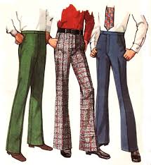
This cover would attract the target audience as it shows young men in clothes which were fashionable at the time of release in 1969. For example the flared trousers were popular at the time.

Abbey Road is also a famous crossing in London, which looks appealing and is a tourist attraction as it is a large Zebra crossing, therefore attracting people who were contemporary with fashion and trends at the time of release.

Christina Aguilera's album 'Bionic'.
The image on this album cover is particular effective of reflecting the title 'Bionic'. Bionic means to have body parts which are electromechanical or to have super human powers. The image used reflects this very well as half of Christian Aguliera's face is mechanical/robotic. The title too reflects the mechanical elements of 'bionic' as it is broken up, as if to be said in a robotic way. The colours used in the typography of the album artist show reference to the image as the same colour red is used for the lips. The normal half of Christina Aguliera's face is important for the cover too as it shows the audience who the album is by without reading the title.
This would appeal to Christina Aguliera's target audience as it shows a young attractive woman, instantly appealing to girls as they can relate to looks and idolize. The album also looks quite arty and abstract, appealing to her target audience here too.
No comments:
Post a Comment